In 2010 a new policy manual was developed for State forest entry and directional road signs.
Over the preceding decades, the standards, materials and colours of State forest signs had drifted to become a visually messy hodgepodge, as each district often did their own thing,
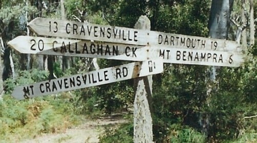
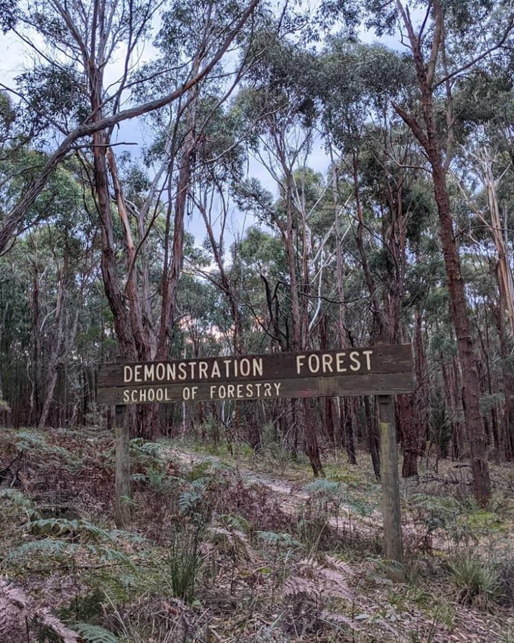
The new signs replaced the old, routed timber ones which had been in service since the early 1970s.
Road signs often were hand painted on a white background using lettering stencils. The colour scheme switched to mission brown in the mid-1960s with the introduction of the iconic “two trees” logo.
It is still possible to find these old Forests Commission signs scattered around the bush, but most are in a pretty bad state of repair.
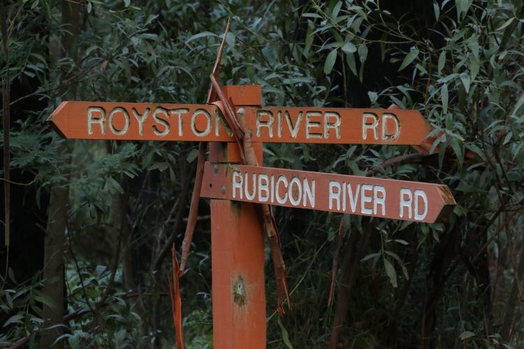
There also was a period from the mid-1980s, after the formation of CFL, when all forest signs switched to Brunswick Green, but it then became hard to distinguish between National Parks and State forest.
Parks Victoria developed their own unique signs not long after they split from the Department in 1996.
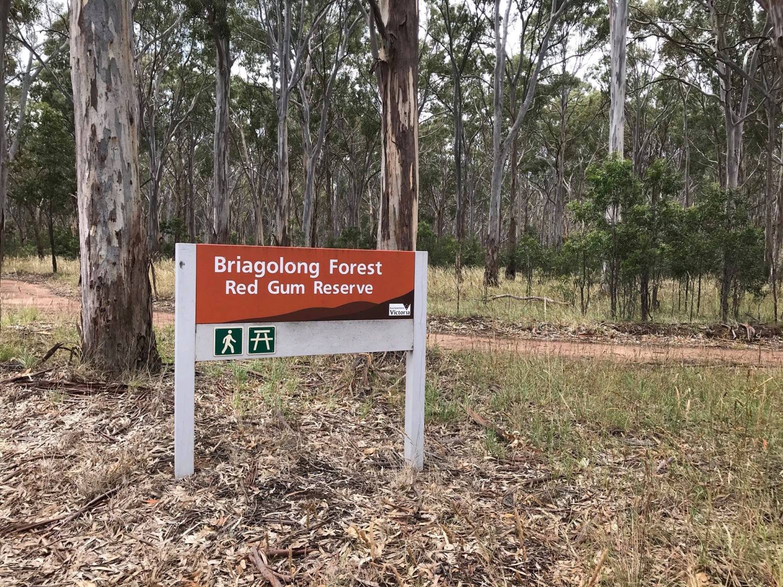
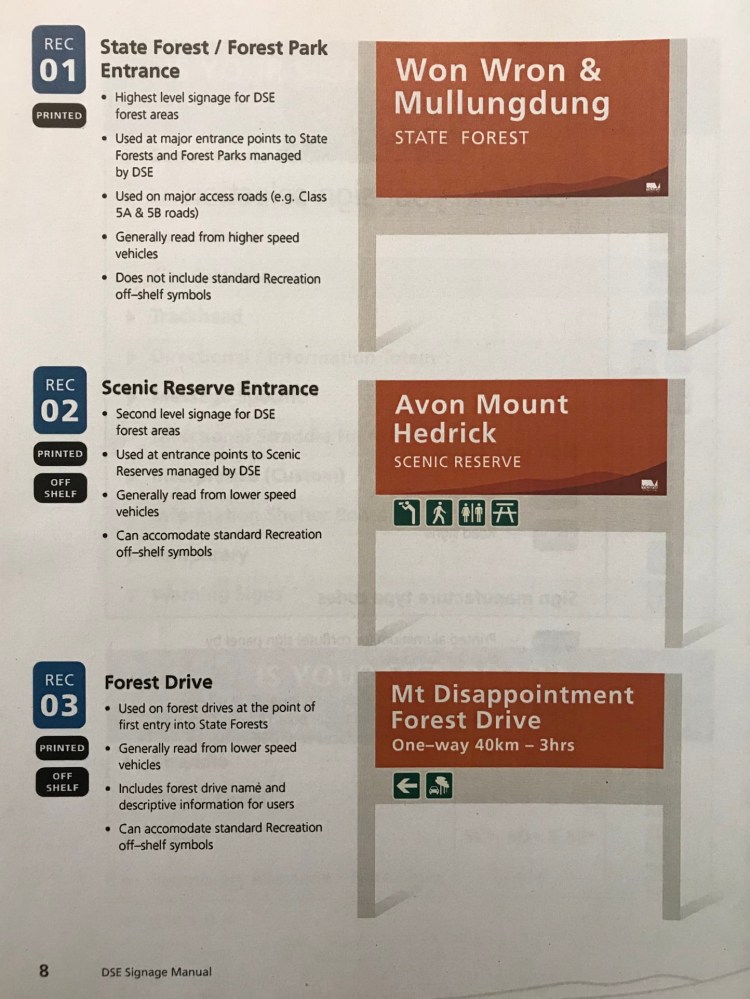
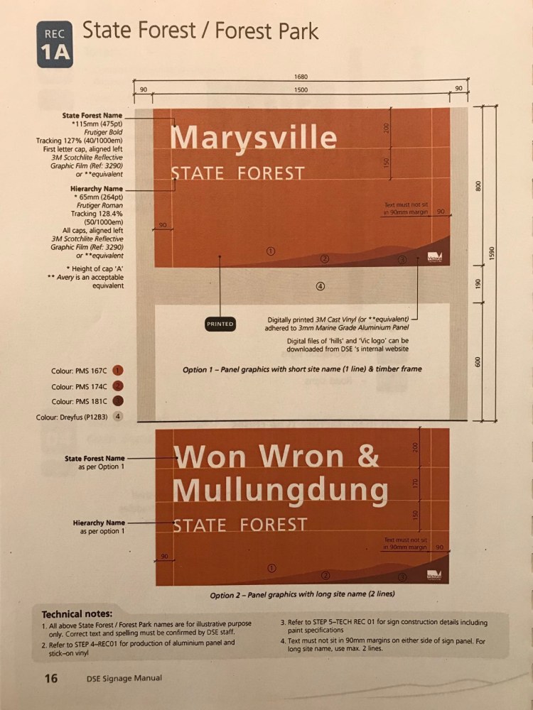
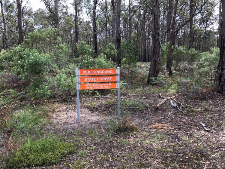
The main switch for the forest signs in 2010 was to modern vinyl cutting technology, a consistent colour scheme. Standard highway fonts were adopted for all lettering that were sharper to read and reflective at night.
All forest entry signs also have a two-tone silhouette of a mountain range in the bottom corner. The Department name was deliberately not included.
Using a mixture of upper-and lower-case lettering so that signs didn’t “SHOUT” at visitors was important too.
The signs are all standard sizes and allowed space for different symbols identifying camping, picnic areas, walking tracks, toilets and so on.
A key consideration was maintaining the ability to make signs quickly and cheaply in-house.
And the ochre colour scheme was a deferential nod the previous Mission Brown used by the Forests Commission.
It was very pleasing to see the new consistent signs appearing in the bush.


One thought on “State Forest Signs.”